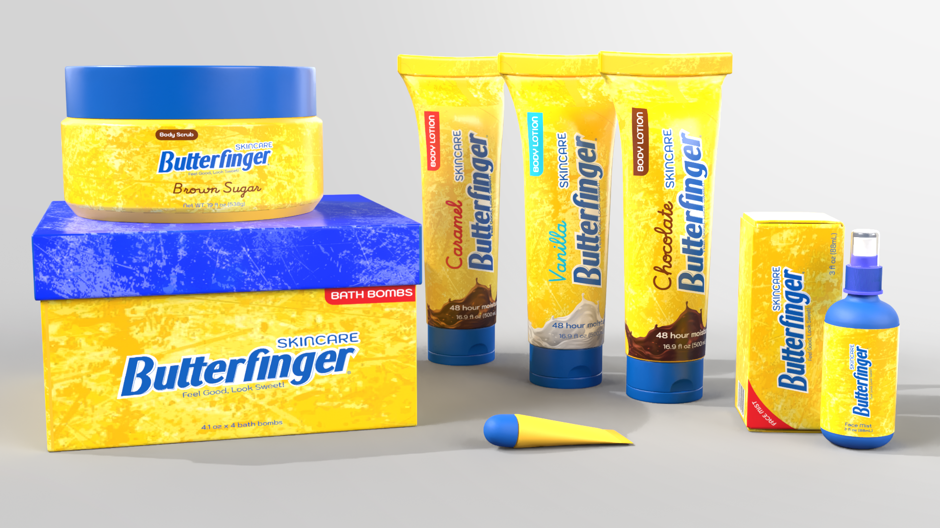
For this project, we were tasked with selecting an existing product and developing a related concept that expands on the brand. For instance, I chose the Butterfinger chocolate bar and reimagined it as a line of skincare products.
Butterfinger Skincare was inspired by the nostalgic joy of savoring Butterfinger bar. The brand was created to turn that indulgence into a luxurious skincare experience, highlighting the belief that self-care should feel as delightful as enjoying a favorite candy. Each product blends buttery textures and nourishing ingredients with gentle exfoliating properties, designed to reveal smoother, radiant skin while pampering your senses. Embrace the joy of self-care with every application.
Brand Story
7 Products First Render: Trial and Error
The logo is not properly aligned and locked up.
The Butterfinger logo is too large on the lotion bottles.
The "Body Lotion" text on the vertical label is difficult to read.
Product names (e.g., Body Lotion, Lip Balm, Bath Bomb, Body Scrub) are inconsistently placed, with some positioned in the left corner, right corner, or bottom left.
The informational text is too faint and hard to read.
Flat Dieline and Final Products
Lip Balm:
Face Mist:
Body Scrub:
Bath Bomb:
The Trio- Body Lotions


